At least once in our life each of us has reached for a book just because of the cover: be it because of a peculiar photo, a conspicuous title or on the contrary, a simple, sober design. The cover of a book must be designed in such a way that it attracts the reader’s eye, regardless of whether it is in a library or a bookstore. “Chip Kidd once said that bookstores are like discos: You only have 3, maximum 5 seconds to get noticed. Of course, you can deliberately dress carelessly, but then you have to be aware that the chances of being noticed are zero. (…) That is why the only sensible thing in this situation is to find a clear element, a key point that draws everyone’s attention ”, explains Ottavio Di Brizzi, head of nonfiction at the Italian publishing house Marsilio.
Illustrators and graphic designers have the important task of making the book even more attractive with the help of original, captivating graphic design. With the means available – images, colors, fonts and graphic elements – they must above all succeed in creating a clear, understandable impression of the content in order to trigger certain thoughts or feelings in the reader. After all, the aim is to find the most suitable target audience for the book in question by arousing their curiosity.
For this reason, we have selected nine particularly exciting book covers for all those who want to expand their knowledge of cover design.
“The Gone-Away World”
The cover of the British writer’s debut novel Nick Harkaway, who is somewhere between science fiction, horror and thriller, effectively combines the various elements of the surreal adventure, in which the two protagonists face the threats of “the erased world” (the title of the German Translation) have to fight.

It is interesting to compare the cover of the US edition by Evan Gaffney, and that of the Italian translation, which shows an illustration by the English artist Mark Brown. The US version with “deformed” font and distorted perspective perfectly reflects the dimension into which the reader is kidnapped. A dimension that, according to a reader review, “represents a parable of human existence in which the main character is confronted with a world that literally collapses on him and leaves the reader speechless”. The graphic chosen is an example of how a feeling of confusion is created in the reader solely by changing the alignment of the letters.
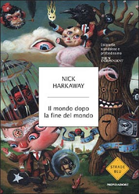
The cover of the Italian edition of Mondadori depicts the unsettling atmosphere in which the story takes place – a world full of monstrous creatures, cannibalistic dogs and ninja fighters: the drawing seems to come from a fairy tale for children, which makes the result even more unique has a more disturbing effect.
“Borne ”
The enigmatic cover of the Italian edition of the novel “Borne” by Jeff VanderMeer, which was published by Einaudi in February 2018, was created by the Italian illustrator and designer Lorenzo Ceccotti, aka LRNZ. A luminous sphere surrounded by a narrow, light blue circle and resting on mysterious gray fur arouses the viewer’s curiosity and invites them to immerse themselves in the author’s bizarre universe, in which the protagonist and her companion, Survivor of a climate catastrophe, meet Borne, a strange creature – half animal, half plant.
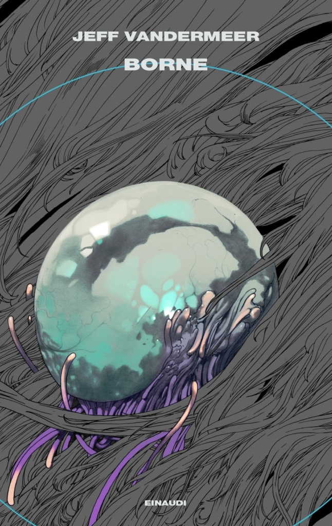
The illustration is a perfect reflection of the post-apocalyptic future, of which the master of “New Weird” – a literary genre that combines elements from fantasy, science fiction and horror – tells.
“The Psychopath Test: A Journey Through the Madness Industry”
The 2011 work by journalist and documentary filmmaker Jon Ronson is a journey through the world of psychopaths and the health industry, which deals with the psychological Well-being deals: It becomes apparent that there are also many mentally disturbed people at the levers of power and even in the professional groups that should treat and research these diseases.

The design that was also used for the German edition “The Psychopaths Are Among Us: A Journey to the Control Centers der Kraft “was used, comes from the illustrator Matt Dorfman and conveys in an outstanding way the personality disorders that are attributed to psychopaths: The” torn paper “is a perfect symbol for the” break “that mental illness in the human brain. Dorfman’s choice shows how a cover can be given a kind of materiality through the use of specifically developed graphics.
“The Sickness Unto Death”
The book designer David Pearson designed this cover for the philosophical work “The Sickness Unto Death” (“The Sickness Unto Death”) published by Penguin Verlag by Søren Kierkegaard. Pearson uses raised letters to express the main theme of the book: Despair, described by the Danish philosopher as a sickness of the mind that makes a man long for death.

The subject of “death” dealt with in the work is highlighted by the black color, the uneven size of the font and the missing Line spacing, through which the letters degenerate into a chaotic collection of troubled, difficult-to-read characters, which is effectively illustrated. An excellent suggestion for illustrators who are looking for a dark mood for the design of a cover.
“Black Transparency: The Right to Know in the Age of Mass Surveillance”
The cover of this book was designed by the authors of the work themselves: the owners of the design agency Metahaven. It exemplifies the concept of “black transparency” imposed on politics due to the activities of hackers and spies who use the leakage of geopolitically relevant news to achieve their goals. The well-known duo from Amsterdam, Vinca Kruk and Daniel van der Velden, is quite familiar with political issues, as both worked for WikiLeaks for several years and designed their merchandising products.
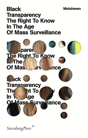
Your cover design is very interesting because you manage a complex topic using a relatively simple, but effective idea to convey: Fragments of an image overlap the title and are reminiscent of secrets that penetrate the public through keyholes from the rooms of the mighty.
“Viaggio in Islanda”
If you were of the opinion that there couldn’t be a cover without a book title, we have to disappoint you: Here is the exception to the rule. The book cover, which was awarded by the jury of the exhibition “Buona la prima” at the Milan book fair “Tempo di Libri” 2018, is a perfect example of how a white cover without text attracts the attention of the Can awaken readers – even more than a gaudy picture. According to the curator of the exhibition, Stefano Salis, the design by Guido Scarabottolo, who also wrote the work, is perfect for a work of art and somewhat less “for a book of which more than 300 copies are to be sold “.

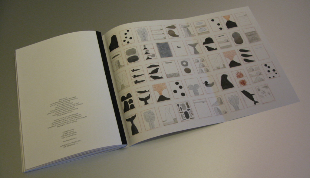
A bold choice that creates the metaphysical and dream-like mood of this notebook, a graphic novel that tells of an imaginary journey of discovery. The editor also has a surprise in store at the end: the reader will find all the drawings in this volume on the back of the dust jacket. An interesting suggestion for all those who are planning the cover of a niche product.
“The Great Gatsby”
One thing should not be missing from this overview: The cover of the first edition of the masterpiece by Francis Scott Fitzgerald “The Great Gatsby” is one of the most famous in the history of publishing. There have always been supporters and opponents of this cover, which in the end did not even appeal to Fitzgerald himself. When a new edition appeared in American bookstores in 2013, the cover of which featured Leonardo Di Caprio (who played the protagonist in the recently released film), a real war of faith broke out between fans of the old cover and those who emphasized the need to offer an apparently new product to a readership always hungry for novelty.
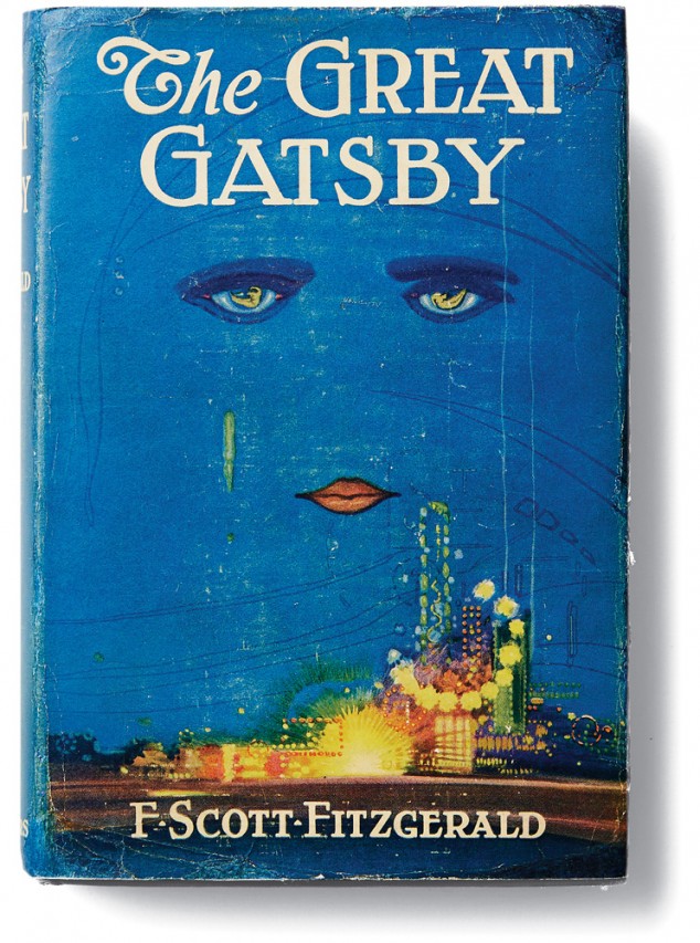
The work of the Spanish illustrator Francis Cugat may have a questionable taste testify, yet the cover conveys in an excellent way the feeling of dissolving and the decadence that is described in the novel. Even if later covers were more refined from a graphical point of view, none of them was equal to this illustration in this respect.

