
At the beginning of the 20th century, before the term graphic design came up, Julius Klinger and Lucian Bernhard were among the most influential poster artists in German-speaking countries. As more and more companies took advantage of the development of different printing techniques, they designed advertising materials in styles that would shape the future of graphic design for a long time to come.
Julius Klinger
Julius Klinger was one of the Austrian designers whose illustrations influenced the design of posters around the turn of the millennium. After studying at the Technological Trade Museum in Vienna, Klinger initially worked as a draftsman for magazines such as Wiener Mode. Inspired by his collaboration with the fashion magazine, he designed his illustrations and caricatures using the visual means of abstraction.
He also shaped the artistic and illustrative poster style through the use of humor. Klinger’s work was particularly distinctive due to the contrast between fine drawings and rough typography. His work described the transition from traditional to early modernist poster art.
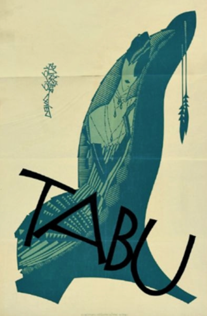
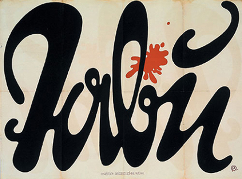
At the beginning of 1918, Klinger designed a widely launched advertising campaign for the well-known “Tabu” cigarette brand, which was circulated over several previously unused areas, such as walls and posters on site fences, making it one of the first strategic ones Promotional campaigns applied.
After working in Munich, Klinger moved to Berlin, where, in addition to poster art, he primarily devoted himself to book illustration. Here he also created works for various public institutions such as the Berlin Zoo or for well-known event rooms. Furthermore, his work convinced with emotions and personality. In the twenties, they laid the foundation for modern graphic art.
In addition, Klinger’s advertising poster for the 1909 autumn flight week in Berlin became very well known. The poster shows four people looking upon a tent labeled with typography and became extremely popular, so it was reissued in different versions. Through work like this, he became one of the most sought-after graphic artists at the Hollerbaum & Schmidt art print company, one of the leading poster printing companies in Germany.
Lucian Bernhard
Lucian Bernhard was a German typographer, graphic designer and professor. He studied at the Munich Art Academy before moving to Hollerbaum & Schmidt in Berlin in 1901. There he produced posters for various dealers, including well-known brands such as the pen manufacturer Pelikan, Faber Castell or the industrial manufacturer Bosch. Bernhard gained popularity with stylistic reinterpretations of advertising space; In addition to the compact message, his posters drew attention to a central pictorial object through reduction.
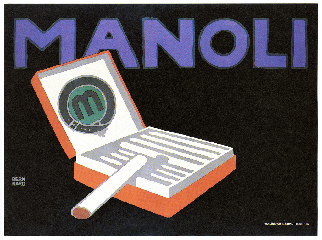
Due to his unmistakable style, the use of stronger colors, more abstract shapes as well as the restriction to essential information, but also the move away from decorative and detailed posters, his poster was considered a forerunner of modernist posters. Bernhard was not only the pioneer of the new genre, which was to remain relevant for several decades and influenced early modernism but also applied his new technology to various brands such as Manoli or Adler. Today he is considered a pioneer of the fact poster. 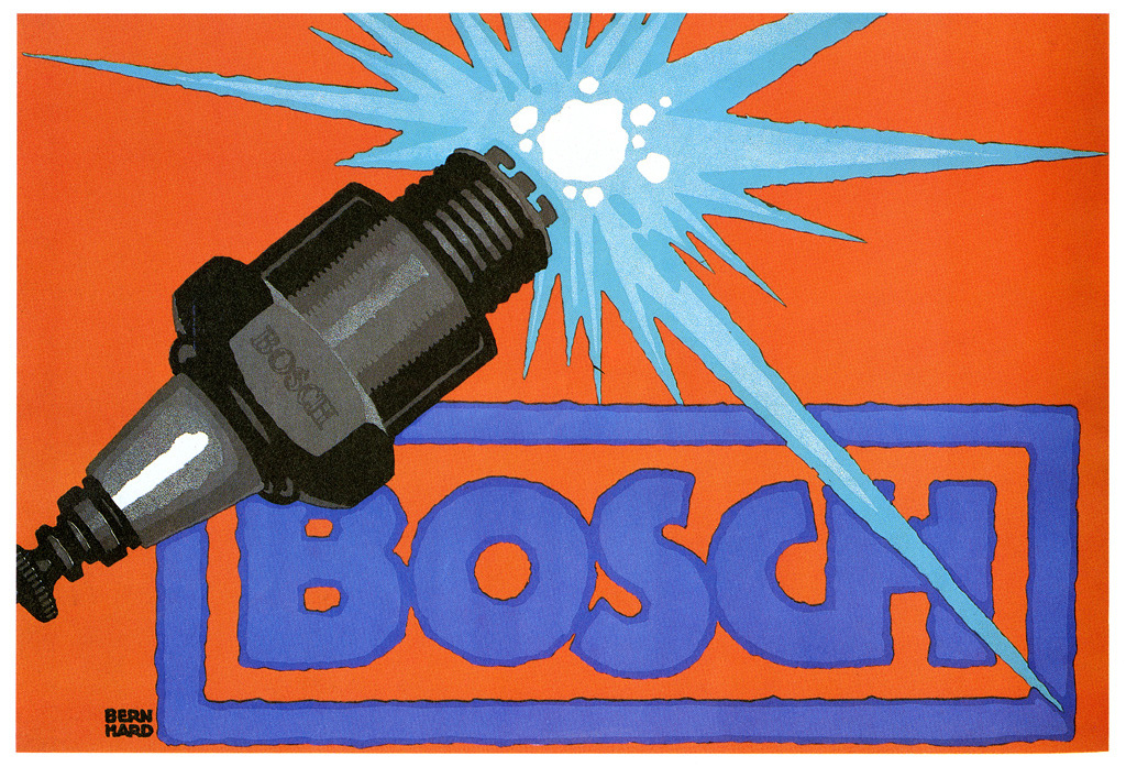
His work influenced the poster and logo design of international brands. He left a footprint at Bosch, where his design still exists as a logo today. In 1914 he designed a poster in which the lettering was arranged in capital letters across the entire drawing area. The illustrative spark plug was aligned diagonally and placed in front of a large color background. Through its use on various posters, this style became formative for the advertising industry at the time. When looking at many modern advertising posters, it becomes clear that the style of Lucian Bernhard still shapes ideas today.
He often used one of his 30+ typefaces such as Bernhard Gotik, Bernhard Fashion or Lucian in his work, with which he characterized the appearance of the brands. Brands like Pelikan still orient their logos to Bernhard’s designs.
Like Klinger, he also designed illustrations and book covers during his time in Berlin. In addition, Berlin was also the place where his magazine Das Plakat was founded, which later became known as Commercial Graphics became known. The magazine was one of the leading design magazines of the century in the 1920s and still exists today as the bilingual magazine Novum.
Lucian Bernhard lived in the USA since the early twenties, where he passed on his intuition-based approach as a professor and increasingly turned to art. His graphic work and font designs characterized by timeless modernity did not lose their impact for a long time.